
This post contains affiliate links. I may earn a small commission if you shop, at no extra cost to you.
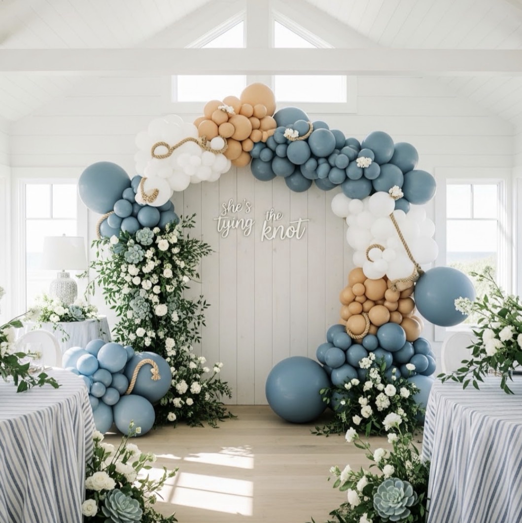
There’s something about a blue and white setup that just feels calm the second you see it.
Not overwhelming. Not busy. Just clean, soft, and intentional.
This “Something Blue Before ‘I Do’” theme leans into that feeling and builds everything around it—from the balloons to the table to the florals—so nothing feels out of place.

The Color Palette (Why This Feels So Polished)
This entire setup stays inside a very controlled palette:
- Soft dusty blues
- Crisp white
- Subtle hints of greenery
- Light touches of gold in the table settings
And the biggest reason it works?
There are no random colors.
Everything stays within that range, which is what makes the whole space feel cohesive instead of pieced together.

The Backdrop + Balloon Design
The arched backdrop sets the tone immediately.
It’s simple, monochromatic, and lets the balloons do the styling without competing with them. The “Something Blue” lettering is clean and centered, which keeps the whole setup feeling balanced.
The balloon install wraps around the arch in a way that feels full but still controlled:
- Different shades of blue layered together
- White clusters breaking it up for contrast
- Larger balloons anchoring the base, smaller ones filling in
It’s detailed, but not chaotic.

The Table Styling (Where This Really Comes Together)
This is where the setup shifts from “pretty” to fully styled.
The long tables mirror the backdrop perfectly:
- White linens with soft blue runners
- Coordinated place settings with gold accents
- Glassware that reflects light and adds a little dimension
And then the florals tie everything together.

The arrangements run down the center of the table in soft blues and whites, pulling the balloon colors directly into the tablescape.
Nothing feels separate—it all connects.

Florals + Details (The Part That Makes It Feel Finished)
The florals aren’t just on the table—they’re repeated throughout the setup.
You see them:
- In the centerpieces
- Near the base of the balloon install
- Worked into the overall color story
That repetition is what makes the space feel intentional.

Even the smaller details—like the candlelight, glass textures, and layered place settings—add to the softness instead of distracting from it.
Why This Theme Works So Well
This setup proves that you don’t need a ton of different elements to make something feel high-end.
You just need consistency.
- One clear color palette
- Repeated textures
- Balloons that support instead of overpower
- A table that actually feels styled, not rushed
That’s what makes this feel complete.

If You Want to Recreate This Look
Start simple:
- Choose 2–3 shades of blue + white and stick to them
- Use a clean backdrop to anchor your space
- Build your balloons with variation in size, not color overload
- Carry your colors into your table runners, florals, and place settings
That’s where the magic is—everything working together.

If you’re looking at this and thinking “okay but how do I actually make that,” I’ve got you. This is the exact organic garland style used in setups like this, and I walk through the full process step-by-step in the video below.
And if you’re looking for a little extra guidance, I’ve put together a small Amazon list of hosting favorites and inspiration, for anyone who wants to browse.
This is one of those themes that feels timeless without feeling boring.
Soft, structured, and just really well put together.

Looking for more fresh bridal shower theme ideas and inspo? Check out this post!


Leave a Reply