If you’ve ever saved a Pinterest image and thought, “Okay but… how would this actually work in real life?” — you’re not alone.
Pinterest is amazing for inspiration. It’s also really good at skipping over logistics, budgets, gravity, wind, time, and the fact that most of us don’t live in styled villas with unlimited space and perfect lighting.

So when I look at party inspo like the images above, I’m not asking “Can I recreate this exactly?”
I’m asking “What’s doing the heavy lifting here — and what’s optional?”
Because that’s the difference between Pinterest fantasy and a setup that actually works.

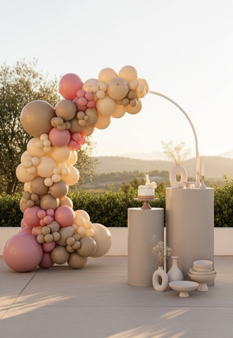
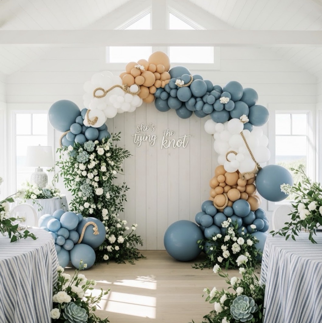
Step One: Identify the Focal Point (There’s Always One)
In both of these images, the focal point is obvious:
a neutral balloon arch framing a clean backdrop.
Not the dessert stands.
Not the florals.
Not the vases.
Your eye goes straight to the balloons because they:
- create height
- define the space
- anchor the entire setup visually
When translating Pinterest inspo into real life, the first question I ask is:
👉 What element would make this still “read” the same if everything else was stripped away?
That’s your priority spend — whether that’s time, money, or effort.
Step Two: Break the Design Into Zones
Pinterest images often look effortless because everything blends together beautifully. In reality, it helps to think in zones:
- The Statement Zone
This is the balloon arch itself. Size, color palette, and placement matter more than anything else here. - The Supporting Zone
Pedestals, dessert stands, cake tables — these add balance and scale, but they don’t need to be elaborate. - The Texture Zone
Pampas grass, dried florals, neutral ceramics. These are visual fillers that soften the setup and make it feel intentional.
You don’t need everything from the inspo image. You need one strong statement and a few quiet supports.
Step Three: Adjust for Real-Life Constraints (This Is Where Pinterest Lies)
Here’s what Pinterest doesn’t show you:
- ceilings that are too low
- wind that will absolutely bully your balloons
- limited floor space
- budgets that aren’t unlimited
So instead of copying the image, I translate it:
- A full arch might become a half arch or corner install
- Oversized backdrops might shrink into a single panel
- Floral moments become clustered accents instead of full installations
The goal isn’t perfection.
The goal is impact without chaos.
Step Four: Keep the Color Palette Simple on Purpose
Neutral palettes work so well in real life because they’re forgiving.
Beige, taupe, blush, soft white — these colors:
- photograph beautifully
- mix well even if shades aren’t exact
- feel elevated without needing extras
When translating Pinterest inspo, limiting your palette does more for the final result than adding more elements ever will.
Step Five: Decide What You’re Willing to Let Go Of
This might be the most important step.
Pinterest images are styled within an inch of their life. Real parties don’t need to be.
If you’re overwhelmed trying to recreate an image, ask:
- What can I remove without losing the overall feel?
- What’s adding stress but not value?
Nine times out of ten, the answer is less, not more.
The Big Picture
Pinterest isn’t the problem.
Trying to recreate it exactly is.
Once you learn how to translate inspo — instead of copying it — party planning gets a lot more fun and a lot less stressful.
You still get the “wow” moment.
You just get there in a way that actually works in real life.
And honestly? That’s better than perfect.
If you’ve ever tried to recreate a Pinterest setup and had to pivot mid-party, I’d love to know — did it end up better than the original plan, or worse?


Leave a Reply