This post contains affiliate links. I may earn a small commission if you shop, at no extra cost to you.
Some baby shower themes feel trendy for a minute and then immediately date themselves.
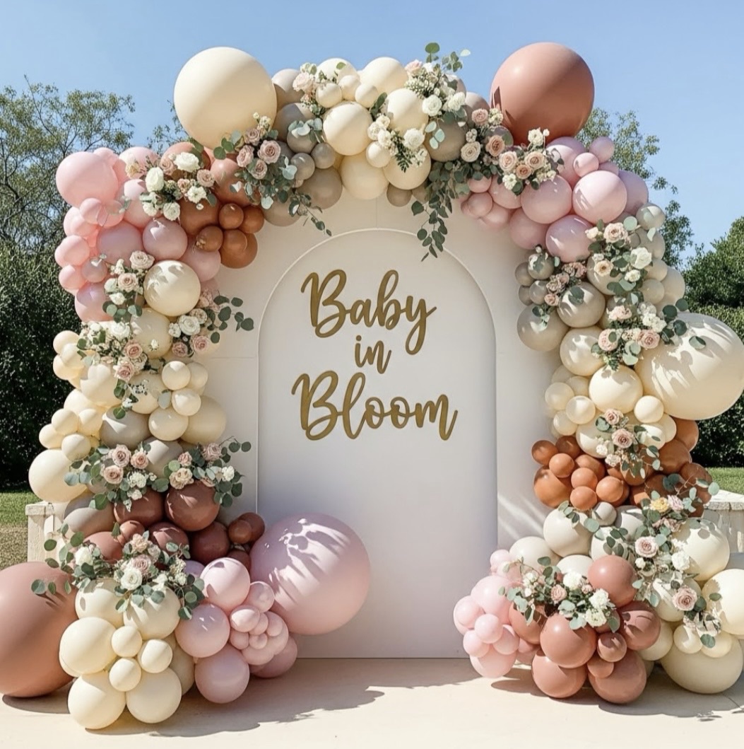
Baby in Bloom is not one of them.

This theme has staying power because it’s rooted in florals, texture, and abundance — not novelty. When done well, it feels editorial, elevated, and intentionally over-the-top in the best way.
If you’re drawn to soft spring color palettes, florals layered into every surface, and decor that feels designed rather than assembled, Baby in Bloom is one of the most beautiful directions you can take.

The Baby in Bloom Aesthetic: Abundance With Intention
At its core, Baby in Bloom is about lushness. Not minimal or restrained.Not “just enough.”
Think layered florals, depth, repetition, and softness — all working together.
The color palette typically lives in:
- Ivory, cream, and warm white
- Blush, peach, soft apricot, and muted pink
- Sage, eucalyptus, and fresh greenery
- Subtle gold accents for warmth and polish
This palette photographs beautifully and allows the florals and textures to be the focal point, rather than relying on themed graphics or novelty decor.

Welcome Sign Styling: Floral, Framed, and Statement-Making
The welcome sign is the first design moment guests experience, and with Baby in Bloom, it should feel like a preview of what’s coming.

Rather than treating the sign as a standalone piece, it works best when it’s styled as part of a vignette:
- A clean, elegant sign design with refined typography
- Positioned on a wood or brushed gold easel
- Framed by oversized florals and greenery at the base and sides
The sign itself stays simple — the florals and balloons do the heavy lifting. This keeps the look timeless while still feeling rich and layered.
Balloon Installations: Sculptural, Floral-Integrated, and Intentional
In a Baby in Bloom design, balloons are not an afterthought — they’re structural.
The most successful installations feel dense and sculptural, built with:
Layered balloon sizes for depth and dimension
- Soft, cohesive tones (cream, blush, warm neutrals, muted pinks)
- Extensive floral integration woven directly into the design
- Florals should feel embedded, not added on top. Greenery softens the balloon structure and ties the entire look back to the garden-inspired theme.
These installations work beautifully as photo backdrops, dessert table framing, and gift or welcome areas.
The result is abundant and dramatic, but still refined.
Tablescape Design: Where Texture Takes Over
This is where Baby in Bloom really shines.
Instead of one centerpiece per table, think in layers:
- Neutral or linen-textured tablecloths
- Floral arrangements that run low and full across the table
- Repetition of greenery to connect each place setting
- Gold flatware or chargers for warmth
- Soft candlelight to add depth and glow

The goal isn’t a single “wow” piece — it’s cohesion from end to end. When every element feels connected, the table reads as intentional and elevated, even if individual pieces are simple.
Why Baby in Bloom Works (Again and Again)

This theme continues to perform well because it:
- Translates beautifully in photos
- Works across seasons, especially spring and early summer
- Appeals to both DIY hosts and professional planners
- Feels elevated without relying on trends
It’s romantic without being fussy, abundant without being chaotic, and polished without feeling stiff.
When executed with layers, texture, and floral-forward design, Baby in Bloom feels timeless — not themed.
And if you’re looking for a little extra guidance, I’ve put together a small Amazon list of hosting favorites and inspiration.


Leave a Reply